

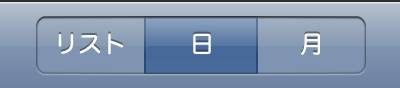
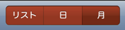
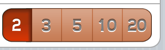
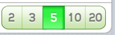
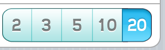
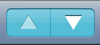
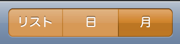
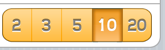
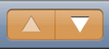
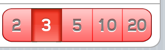
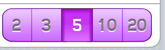
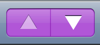
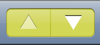
セグメント
iTunesやAppStoreで良く見かけます。
サブメニュー的に使われることの多いボタンです。
ラジオボタンのようなものでしょうか。
オリジナル画像サイズ詳細
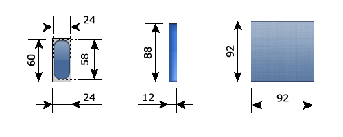
使われ方によっていろいろな画像が用意されています。
参考にして下さい。
テーマ構成ファイル一覧 & オリジナル画像
| テーマ名/UIImages/ | ||
|
UISegmentBarBlackButton@2x.png (24×60) |
 |
|
|
UISegmentBarBlackButtonHighlighted@2x.png (24×60) |
 |
|
|
UISegmentBarBlackDivider@2x.png (2×60) |
 |
|
|
UISegmentBarBlackDividerHighlighted@2x.png (2×60) |
 |
|
|
UISegmentBarBlackMiniButton@2x.png (20×48) |
 |
|
|
UISegmentBarBlackMiniButtonHighlighted@2x.png (20×48) |
 |
|
|
UISegmentBarBlackMiniDivider@2x.png (2×48) |
 |
|
|
UISegmentBarBlackMiniDividerHighlighted@2x.png (2×48) |
 |
|
|
UISegmentBarButton@2x.png (24×60) |
 |
|
|
UISegmentBarButtonHighlighted@2x.png (24×60) |
 |
|
|
UISegmentBarDivider@2x.png (2×60) |
 |
|
|
UISegmentBarDividerHighlighted@2x.png (2×60) |
 |
|
|
UISegmentBarMiniButton@2x.png (20×48) |
 |
|
|
UISegmentBarMiniButtonHighlighted@2x.png (20×48) |
 |
|
|
UISegmentBarMiniDivider@2x.png (2×48) |
 |
|
|
UISegmentBarMiniDividerHighlighted@2x.png (2×48) |
 |
|
|
UISegmentBorderedButton@2x.png (44×88) |
 |
|
|
UISegmentBorderedButtonHighlighted@2x.png (44×88) |
 |
|
|
UISegmentBorderedDivider@2x.png (2×88) |
 |
|
|
UISegmentBorderedDividerHilightedLeft@2x.png (12×88) |
 |
|
|
UISegmentBorderedDividerHilightedRight@2x.png (12×88) |
 |
|
|
UISegmentButton@2x.png (44×88) |
 |
|
|
UISegmentButtonHighlighted@2x.png (44×88) |
 |
|
|
UISegmentDivider@2x.png (2×88) |
 |
|
|
UISegmentDividerHilightedLeft@2x.png (12×88) |
 |
|
|
UISegmentDividerHilightedRight@2x.png (12×88) |
 |
|
|
UISegmentOptionsBackground@2x.png (2×88) |
 |
|
|
UISegmentOptionsButton@2x.png (22×60) |
 |
|
|
UISegmentOptionsButtonBlackTranslucent@2x.png (22×60) |
 |
|
|
UISegmentOptionsButtonBlue@2x.png (22×60) |
 |
|
|
UISegmentOptionsButtonSelected@2x.png (22×60) |
 |
|
|
UISegmentOptionsButtonSelectedBlackTranslucent@2x.png (22×60) |
 |
|
|
UISegmentOptionsButtonSelectedBlue@2x.png (22×60) |
 |
|
|
UISegmentOptionsDivider@2x.png (2×60) |
 |
|
|
UISegmentOptionsDividerBlackTranslucent@2x.png (2×60) |
 |
|
|
UISegmentOptionsDividerBlue@2x.png (2×60) |
 |
|
|
UISegmentOptionsDividerSelected@2x.png (2×60) |
 |
|
|
UISegmentOptionsDividerSelectedBlackTranslucent@2x.png (2×60) |
 |
|
|
UISegmentOptionsDividerSelectedBlue@2x.png (2×60) |
 |
|
|
UISegmentTexturedButtonHighlightedCenter@2x.png (92×92) |
 |
|
|
UISegmentTexturedButtonHighlightedLeftCap@2x.png (18×92) |
 |
|
|
UISegmentTexturedButtonHighlightedRightCap@2x.png (18×92) |
 |
|
|
UISegmentTexturedButtonSelectedCenter@2x.png (92×92) |
 |
|
|
UISegmentTexturedButtonSelectedHighlightedCenter@2x.png (92×92) |
 |
|
|
UISegmentTexturedButtonSelectedHighlightedLeftCap@2x.png (18×92) |
 |
|
|
UISegmentTexturedButtonSelectedHighlightedRightCap@2x.png (18×92) |
 |
|
|
UISegmentTexturedButtonSelectedLeftCap@2x.png (18×92) |
 |
|
|
UISegmentTexturedButtonSelectedRightCap@2x.png (18×92) |
 |
|
|
UISegmentTexturedDivider@2x.png (2×92) |
 |
|
|
UISegmentTexturedHighlightedDivider@2x.png (2×92) |
 |
|
|
UISegmentTexturedSelectedDivider@2x.png (2×92) |
 |
|
|
UISegmentTexturedSelectedHighlightedDivider@2x.png (2×92) |
 |
|
<注意>
"Divider"と名のつく画像は幅2pxですが、背景画像ではないので伸ばしていません。
テクスチャー画像がどこで使われているか分かりません。
<注意>
ここで紹介しているファイル名や画像サイズは、Retinaディスプレイ用です。
iOS4.xの時と違い、iOS5に対応したwinterboardでは「@2xファイル」と「@2xを省いたファイル」をセットで用意する必要がなくなりました。
参考までにこちらをご覧下さい。ーー> artworkファイルについて
作ってみた
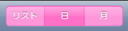
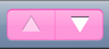
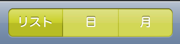
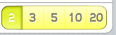
オリジナルデザインをそのままに、カラーバリエーションを増やしてみました。
<注意>
作った画像は、Retina用の画像のみで、iPhone4からの転載です。
そのままwinterboardで適用できるファイル構成にはしていますが、Retinaディスプレイではないデバイスで適用するときは、リサイズして下さい。
boke_lightblue_segment.zipのダウンロード
boke_orange_segment.zipのダウンロード
boke_violet_segment.zipのダウンロード
boke_yellow_segment.zipのダウンロード